Run Detail
completedcrouton-alphaRecorded for these videos
 27:18
Gemini 4 Hydrogen: Cheaper Tokens, More Expensive Answers?
Nov 13, 2026 · YouTube
 18:40
ERNIE 5.5 Flash Preview vs GLM 5.3 Flash: Baidu's new model is very impressive!
Nov 11, 2026 · YouTube
 36:22
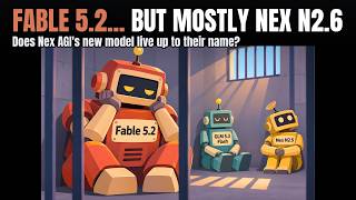
Fable 5.2 robbing me blind, plus: Nex AGI's N2.6 vs GLM 5.3 Flash
Nov 11, 2026 · YouTube
 14:03
Gemini 4 Carbon: Can it handle my challenges? (First look with one-shot coding tests)
Nov 10, 2026 · YouTube
 47:51
Ranking major U.S. Open-Weights Models. (Where does Ripple 65B fit in?)
Nov 6, 2026 · YouTube
 10:57
"Crouton Alpha": the latest super-efficient coding model by Meta?
Nov 3, 2026 · YouTube
 38:58
Testing Particle-1: a post-trained DeepSeek V4.1 Flash specializing in coding and efficiency
Oct 28, 2026 · YouTube
 29:55
Kimi K3.1 Pro Looked Incredible. Then I Kept Testing.
Oct 26, 2026 · YouTube
 31:28
Is this company reselling GPT Sol 6.1 at a loss (for non-agentic/text-only)?🤔 Is this sustainable?
Oct 20, 2026 · YouTube
 17:58
Nemotron 3.5 Super VL vs Opus 5.5: Testing NVIDIA’s new coding juggernaut
Oct 15, 2026 · YouTube
 16:04
Testing a *massive* new open-weights model 🤯: Muse Spark Open (vs. Nemotron, Opus 5.5, and more)
Oct 15, 2026 · YouTube
 16:43
Gemini 4 Argon: Great 🐈 Animation, but a broken escalator. (Coding challenge vs Opus 5.5, Sol 6.1)
Oct 13, 2026 · YouTube
 16:37
Meta's new "Muse Wonder" AI is impressive... but can it compete with Anthropic's models?
Oct 12, 2026 · YouTube
 11:12
WOW... Haiku 5.5 is very impressive. RIP OpenAI?
Oct 7, 2026 · YouTube
 22:47
Mistral Large 4 Is Cheap. But Is It Good Enough to Compete?
Oct 6, 2026 · YouTube
 22:02
Is Pareto 26.10 Preview Just Routing to GPT Sol? I Tested It Against Sol 6.1 Pro
Oct 1, 2026 · YouTube
 11:22
I Tested Sonnet 5.5 Against Opus 5.5. Is It Actually Cheaper?
Sep 28, 2026 · YouTube
 19:21
I Tested the Stealth "Space Bunny Alpha" Model Before It Went Offline
Sep 23, 2026 · YouTube
 10:58
So... how much better is Claude Opus 5.5 vs. GPT-6 Sol, really?
Sep 23, 2026 · YouTube
 9:38
Claude Opus 5.5... the BEST new model for coding!! 🤩
Sep 22, 2026 · YouTube
Provider
openrouter
Challenge Version
v2.0
Turns
1
Duration
25.7s
Total Tokens
6,194
Input Tokens
707
Output Tokens
5,487
Reasoning Tokens
73
Reasoning Effort
default
Est. Cost
$0.0000
Started
11/3/2026, 9:27:50 PM
OR Provider
Stealth
Finish Reason
stop
Generation ID
gen-1793741270-OYg7tMkLUf05DUQd1DbN
Turns (1)
Turn #1
707 in5,487 out73 reasoning6,194 total25.7s
user
You make short animated pieces for the web, and you have spent time on the part of the internet that makes cats famous.
Build me a single HTML page: a cat in a living room that lifts off the floor and spins in the air when you click it.
The reference
Make this the Oiia Cat — the spinning cat meme, the one whose loop is written out as "oiia oiia oiiaiooooiai". Match the original's look and feel, not a generic rotation:
- A cream-and-white cat sitting square to the camera, eyes wide, staring straight down the lens, doing nothing.
- It starts turning on its vertical axis. The turn accelerates until the cat is a blur and the face is no longer readable.
- The "oiia" vocal rides the spin. Rate and pitch climb together with it, so the sound is the spin.
- In the edits this page is chasing, the cat leaves the floor. It rises as it winds up and spins in midair, and the room gets pulled into whatever the edit is doing.
Build toward what that meme feels like at full speed: too fast, too loud, and funnier every time it goes further.
The build
- It opens quiet. The cat sitting in a real living room, doing nothing in particular. Push the realism as far as one file will take you — light that comes from somewhere in the room, depth behind the cat, fur that is not a flat shape, a floor that the cat is actually resting on. Someone arriving on this page should need a second to work out that it is not a photograph. That opening second is the whole joke and it only pays off if the room is convincing first.
- Click the cat and it activates: it turns to face the viewer, lifts off the floor, and spins on its vertical axis in midair, fast, with the room going with it.
- Every click after that escalates, and escalation here means crazier, not just faster. Four stages at least, each visibly and inventively past the one before — what the cat does, how high it goes, what happens to the room, what happens to the laws of physics, what else joins in. Stage four should be the one that makes someone send the page to a friend. It still has to be worth watching: a strobing white rectangle is not stage four.
- It makes the sound. The "oiia" loop, synthesized in the file with Web Audio, rising as the spin gets faster. Making it read as a voice rather than as a tone is most of this requirement.
- Sound starts on the click and never before, and I can mute it.
House rules
- One file. Everything inline — no CDN, no external stylesheet, font, script or image.
data:URIs are fine. - No libraries.
- No network at runtime.
- No
localStorage,sessionStorage, cookies orindexedDB— sandboxed frame, they throw. - Return the file as exactly one fenced
htmlblock.
Answer in exactly these sections
The page
The single fenced html block.
The notes
Five bullets.
- How the opening frame gets its realism, and where that realism gives out.
- What you did to make it read as the Oiia cat rather than as a cat that rotates.
- The four stages, in order, and what makes each one crazier than the last.
- How the voice is synthesized, and what keeps it locked to the spin.
- The part you would fix with more time.
assistant
The page
<!DOCTYPE html>
<html lang="en">
<head>
<meta charset="UTF-8">
<meta name="viewport" content="width=device-width,initial-scale=1">
<title>Oiia Cat — Crouton Alpha</title>
<style>
*{margin:0;padding:0;box-sizing:border-box}
html,body{width:100%;height:100%;overflow:hidden;background:#1a120b;font-family:Georgia,serif}
#scene{position:fixed;inset:0;overflow:hidden;perspective:900px;background:linear-gradient(180deg,#3a2a1c 0%,#5a4030 38%,#2b1a10 38.2%,#4a2e18 100%);transition:transform 1.2s cubic-bezier(.2,.8,.2,1),filter 1.2s}
#wall{position:absolute;inset:0 0 42% 0;background:linear-gradient(180deg,#6b4f36,#8a6a4a 55%,#7a5a3e);box-shadow:inset 0 -30px 60px rgba(0,0,0,.45)}
#wall:before{content:"";position:absolute;inset:0;background:radial-gradient(ellipse 70% 55% at 72% 38%,rgba(255,214,140,.55),transparent 60%),radial-gradient(ellipse 50% 40% at 20% 30%,rgba(255,240,200,.18),transparent 70%)}
#floor{position:absolute;left:-20%;right:-20%;bottom:-10%;height:52%;background:repeating-linear-gradient(90deg,#6b4423 0 72px,#5d3a1e 72px 74px),linear-gradient(180deg,#7a4f28,#3d2410);transform:rotateX(58deg);transform-origin:bottom;box-shadow:inset 0 40px 80px rgba(0,0,0,.6)}
#rug{position:absolute;left:50%;bottom:6%;width:62vmin;height:22vmin;transform:translateX(-50%) rotateX(62deg);background:radial-gradient(ellipse at center,#a33b2e 0 52%,#7e2a20 53% 68%,#c9a86a 69% 72%,#5e1f18 73%);border-radius:50%;box-shadow:0 20px 40px rgba(0,0,0,.5),inset 0 0 40px rgba(0,0,0,.4);opacity:.95}
.furn{position:absolute;filter:blur(.6px)}
#sofa{left:4%;bottom:30%;width:34%;height:26%;background:linear-gradient(180deg,#3e4a3a,#2c362a);border-radius:18px 18px 8px 8px;box-shadow:0 18px 30px rgba(0,0,0,.5),inset 0 10px 20px rgba(255,255,255,.08)}
#sofa:before{content:"";position:absolute;left:6%;right:6%;top:-18%;height:38%;background:linear-gradient(180deg,#4a5a44,#35422f);border-radius:14px}
#sofa:after{content:"";position:absolute;left:10%;top:18%;width:34%;height:52%;background:linear-gradient(180deg,#5a6a52,#3e4a38);border-radius:10px;box-shadow:52% 0 0 #46543f}
#lamp{right:9%;bottom:34%;width:70px;height:180px;transform-origin:bottom center}
#lamp:before{content:"";position:absolute;left:50%;top:0;width:64px;height:52px;transform:translateX(-50%);background:linear-gradient(180deg,#ffe9b0,#e8b86a);clip-path:polygon(20% 0,80% 0,100% 100%,0 100%);box-shadow:0 0 60px 30px rgba(255,200,100,.45)}
#lamp:after{content:"";position:absolute;left:50%;bottom:0;width:6px;height:130px;background:#2a1a0e;transform:translateX(-50%)}
#window{left:38%;top:7%;width:24%;height:28%;background:linear-gradient(180deg,#cfe8ff,#8fb8d8 60%,#6a94b8);border:10px solid #3a2614;box-shadow:0 0 0 4px #5a3d22,0 20px 40px rgba(0,0,0,.4),inset 0 0 40px rgba(255,255,255,.5)}
#window:before{content:"";position:absolute;left:50%;top:0;bottom:0;width:6px;background:#3a2614}
#window:after{content:"";position:absolute;top:50%;left:0;right:0;height:6px;background:#3a2614}
#shelf{right:22%;top:12%;width:11%;height:30%;background:linear-gradient(180deg,#4a2e16,#2e1a0a);box-shadow:0 10px 20px rgba(0,0,0,.4)}
#shelf:before{content:"";position:absolute;inset:8% 10%;background:repeating-linear-gradient(180deg,transparent 0 28%,#2a1a0a 28% 32%),repeating-linear-gradient(90deg,#a33b2e 0 10px,#2e4a6a 10px 20px,#c9a86a 20px 28px,#5a7a3a 28px 38px)}
#plant{left:16%;bottom:36%;width:54px;height:90px}
#plant:before{content:"";position:absolute;bottom:0;left:20%;right:20%;height:36px;background:linear-gradient(180deg,#a85a2a,#7a3a16);border-radius:4px 4px 10px 10px}
#plant:after{content:"";position:absolute;bottom:28px;left:0;width:100%;height:60px;background:radial-gradient(ellipse at 30% 70%,#3a6a2a 0 18px,transparent 19px),radial-gradient(ellipse at 60% 40%,#4a7a32 0 22px,transparent 23px),radial-gradient(ellipse at 80% 70%,#2e5a22 0 16px,transparent 17px)}
#frame{left:62%;top:10%;width:12%;height:16%;background:linear-gradient(135deg,#d8c8a8,#a89878);border:8px solid #3a2614;box-shadow:0 10px 20px rgba(0,0,0,.4)}
#frame:before{content:"";position:absolute;inset:12%;background:radial-gradient(circle at 40% 40%,#e8d8b0,#8a7a5a)}
#rays{position:absolute;inset:0;background:linear-gradient(115deg,transparent 55%,rgba(255,230,160,.14) 68%,transparent 82%);mix-blend-mode:screen;pointer-events:none}
#vignette{position:absolute;inset:0;background:radial-gradient(ellipse at center,transparent 55%,rgba(0,0,0,.55));pointer-events:none;z-index:5}
.dust{position:absolute;width:4px;height:4px;border-radius:50%;background:rgba(255,240,200,.7);filter:blur(1px);animation:drift 9s linear infinite;z-index:4}
@keyframes drift{0%{transform:translate(0,0);opacity:0}20%{opacity:.8}100%{transform:translate(60px,-120px);opacity:0}}
#catWrap{position:absolute;left:50%;bottom:9%;width:34vmin;height:38vmin;transform:translateX(-50%);z-index:10;perspective:700px;cursor:pointer;-webkit-tap-highlight-color:transparent}
#catShadow{position:absolute;left:50%;bottom:-4%;width:70%;height:8%;transform:translateX(-50%);background:radial-gradient(ellipse,rgba(0,0,0,.65),transparent 70%);border-radius:50%;transition:transform .3s,opacity .3s}
#cat{position:absolute;inset:0;transform-style:preserve-3d;will-change:transform,filter;animation:breathe 3.2s ease-in-out infinite}
@keyframes breathe{0%,100%{scale:1 1}50%{scale:1.01 .985}}
#cat svg{width:100%;height:100%;display:block;overflow:visible}
.clone{position:absolute;inset:0;opacity:0;pointer-events:none;transform-style:preserve-3d}
.clone svg{width:100%;height:100%}
#hint{position:absolute;left:50%;bottom:3%;transform:translateX(-50%);color:rgba(255,240,210,.85);font-size:14px;letter-spacing:.18em;text-transform:uppercase;text-shadow:0 2px 8px #000;z-index:20;transition:opacity .5s;text-align:center}
#ui{position:absolute;top:14px;right:14px;z-index:30;display:flex;gap:8px;align-items:center}
button{background:rgba(20,12,6,.75);color:#ffe9b0;border:1px solid rgba(255,220,150,.5);padding:8px 14px;border-radius:20px;cursor:pointer;font-family:inherit;letter-spacing:.08em}
#stageLabel{position:absolute;top:16px;left:16px;color:#ffe9b0;text-shadow:0 2px 10px #000;z-index:30;font-size:13px;letter-spacing:.2em;text-transform:uppercase}
.oiiaText{position:absolute;color:#fff;font-weight:900;text-shadow:0 0 12px #ff6a00,0 2px 0 #000;pointer-events:none;z-index:15;animation:floatUp 1.6s ease-out forwards;font-style:italic}
@keyframes floatUp{0%{transform:translateY(0) rotate(var(--r)) scale(.6);opacity:0}20%{opacity:1}100%{transform:translateY(-46vh) rotate(var(--r)) scale(1.4);opacity:0}}
#vortex{position:absolute;left:50%;top:46%;width:90vmin;height:90vmin;transform:translate(-50%,-50%);border-radius:50%;opacity:0;pointer-events:none;z-index:6;background:repeating-conic-gradient(from 0deg,transparent 0 12deg,rgba(255,180,80,.12) 12deg 18deg,transparent 18deg 36deg);animation:spinV 6s linear infinite;transition:opacity 1s}
@keyframes spinV{to{transform:translate(-50%,-50%) rotate(360deg)}}
body.s1 #scene{transform:rotate(-1deg) scale(1.02)}
body.s2 #scene{transform:rotate(2deg) scale(1.06);filter:saturate(1.2)}
body.s2 #lamp{animation:swing 1.1s ease-in-out infinite alternate}
@keyframes swing{from{transform:rotate(-7deg)}to{transform:rotate(7deg)}}
body.s3 #scene{transform:rotate(-4deg) scale(1.12);filter:saturate(1.5) hue-rotate(12deg)}
body.s3 .furn{animation:floaty 3s ease-in-out infinite alternate}
@keyframes floaty{from{transform:translateY(0) rotate(0)}to{transform:translateY(-18px) rotate(2deg)}}
body.s4 #scene{transform:rotate(3deg) scale(1.22);filter:saturate(1.8) hue-rotate(-18deg)}
body.s4 #vortex{opacity:1}
body.s4 #lamp{animation:swing .5s ease-in-out infinite alternate}
body.s4 .furn{animation:floaty 1.2s ease-in-out infinite alternate}
@media(max-width:600px){#catWrap{width:52vmin;height:58vmin}#sofa{width:44%}#window{width:32%}}
</style>
</head>
<body>
<svg width="0" height="0" style="position:absolute">
<defs>
<linearGradient id="fur" x1="0" y1="0" x2="0" y2="1"><stop offset="0" stop-color="#fdf6e3"/><stop offset=".55" stop-color="#f1e2c2"/><stop offset="1" stop-color="#d9c49a"/></linearGradient>
<linearGradient id="chest" x1="0" y1="0" x2="0" y2="1"><stop offset="0" stop-color="#fffdf5"/><stop offset="1" stop-color="#efe3c8"/></linearGradient>
<radialGradient id="eye" cx=".5" cy=".45" r=".55"><stop offset="0" stop-color="#d8f0a0"/><stop offset=".55" stop-color="#8ab84a"/><stop offset="1" stop-color="#3a5a1a"/></radialGradient>
<filter id="rough"><feTurbulence type="fractalNoise" baseFrequency=".9" numOctaves="2" result="n"/><feDisplacementMap in="SourceGraphic" in2="n" scale="3"/></filter>
<symbol id="catSym" viewBox="0 0 300 340">
<g filter="url(#rough)">
<path d="M210 260 Q285 250 275 200 Q268 165 225 175 Q250 210 210 260" fill="#e8d8b4"/>
<path d="M55 300 Q30 260 70 235 Q95 220 105 260 Q95 295 55 300" fill="#e8d8b4"/>
<ellipse cx="150" cy="245" rx="92" ry="78" fill="url(#fur)"/>
<path d="M105 180 Q150 165 195 180 L200 320 Q150 335 100 320 Z" fill="url(#chest)"/>
<path d="M78 285 L78 325 Q95 335 112 325 L112 285 Z" fill="#fffdf5"/><path d="M188 285 L188 325 Q205 335 222 325 L222 285 Z" fill="#fffdf5"/>
<ellipse cx="95" cy="328" rx="20" ry="9" fill="#fffdf5"/><ellipse cx="205" cy="328" rx="20" ry="9" fill="#fffdf5"/>
<path d="M62 150 L52 62 L118 102 Z" fill="url(#fur)"/><path d="M238 150 L248 62 L182 102 Z" fill="url(#fur)"/>
<path d="M70 128 L64 82 L102 106 Z" fill="#e8a8a0"/><path d="M230 128 L236 82 L198 106 Z" fill="#e8a8a0"/>
<circle cx="150" cy="138" r="82" fill="url(#fur)"/>
<path d="M95 78 Q110 70 125 78 M175 78 Q190 70 205 78" stroke="#c9b48a" stroke-width="4" fill="none" stroke-linecap="round"/>
<ellipse cx="112" cy="132" rx="26" ry="30" fill="#fff"/><ellipse cx="188" cy="132" rx="26" ry="30" fill="#fff"/>
<ellipse cx="112" cy="134" rx="19" ry="24" fill="url(#eye)"/><ellipse cx="188" cy="134" rx="19" ry="24" fill="url(#eye)"/>
<ellipse cx="112" cy="136" rx="8" ry="17" fill="#0a0a0a"/><ellipse cx="188" cy="136" rx="8" ry="17" fill="#0a0a0a"/>
<circle cx="105" cy="122" r="6" fill="#fff"/><circle cx="181" cy="122" r="6" fill="#fff"/><circle cx="118" cy="146" r="3" fill="#fff" opacity=".8"/><circle cx="194" cy="146" r="3" fill="#fff" opacity=".8"/>
<path d="M142 168 Q150 162 158 168 Q158 176 150 178 Q142 176 142 168" fill="#d88a8a"/>
<path d="M150 178 Q150 186 140 188 M150 178 Q150 186 160 188" stroke="#8a6a4a" stroke-width="2.5" fill="none" stroke-linecap="round"/>
<g stroke="#fff" stroke-width="1.6" opacity=".85"><path d="M60 170 L115 178 M62 185 L115 184 M70 198 L118 190 M240 170 L185 178 M238 185 L185 184 M230 198 L182 190"/></g>
<path d="M120 210 Q150 222 180 210" stroke="#d9c49a" stroke-width="3" fill="none" opacity=".6"/>
</g></symbol>
</defs></svg>

<div id="scene">
<div id="wall"></div><div id="floor"></div><div id="rug"></div>
<div class="furn" id="window"></div><div class="furn" id="frame"></div><div class="furn" id="shelf"></div>
<div class="furn" id="sofa"></div><div class="furn" id="plant"></div><div class="furn" id="lamp"></div>
<div id="rays"></div><div id="vortex"></div>
<div id="catWrap" title="click the cat">
<div id="catShadow"></div>
<div id="cat"><svg><use href="#catSym"/></svg></div>
<div class="clone" id="c1"><svg><use href="#catSym"/></svg></div>
<div class="clone" id="c2"><svg><use href="#catSym"/></svg></div>
<div class="clone" id="c3"><svg><use href="#catSym"/></svg></div>
<div class="clone" id="c4"><svg><use href="#catSym"/></svg></div>
<div class="clone" id="c5"><svg><use href="#catSym"/></svg></div>
<div class="clone" id="c6"><svg><use href="#catSym"/></svg></div>
<div class="clone" id="c7"><svg><use href="#catSym"/></svg></div>
</div>
<div id="vignette"></div>
</div>
<div id="stageLabel">oiia — click the cat</div>
<div id="ui"><button id="mute">🔊 sound on</button></div>
<div id="hint">click the cat</div>

<script>
const wrap=document.getElementById('catWrap'),cat=document.getElementById('cat'),shadow=document.getElementById('catShadow'),scene=document.getElementById('scene'),hint=document.getElementById('hint'),label=document.getElementById('stageLabel');
const clones=[...document.querySelectorAll('.clone')];
for(let i=0;i<22;i++){let d=document.createElement('div');d.className='dust';d.style.left=(10+Math.random()*80)+'%';d.style.top=(15+Math.random()*60)+'%';d.style.animationDelay=(Math.random()*9)+'s';scene.appendChild(d)}
let stage=0,angle=0,speed=0,lift=0,last=performance.now(),muted=false,actx=null,master,osc,osc2,f1,f2,vgain,noiseGain;
const targetSpeed=[0,260,520,900,1350],targetLift=[0,70,150,230,300],names=['oiia — click the cat','stage 1 · lift-off','stage 2 · room joins in','stage 3 · gravity gives up','stage 4 · oiia oiia oiiaiooooiai'];
const vowels=[[570,840],[270,2290],[730,1090],[570,840],[270,2290],[730,1090],[900,1400],[500,900]]; // o i a o i a o o
function initAudio(){
 if(actx) return; actx=new (window.AudioContext||window.webkitAudioContext)();
 master=actx.createGain();master.gain.value=.9;master.connect(actx.destination);
 let shaper=actx.createWaveShaper();let curve=new Float32Array(256);for(let i=0;i<256;i++){let x=i/128-1;curve[i]=Math.tanh(x*2.2)}shaper.curve=curve;
 osc=actx.createOscillator();osc.type='sawtooth';osc.frequency.value=110;
 osc2=actx.createOscillator();osc2.type='sine';osc2.frequency.value=55;
 f1=actx.createBiquadFilter();f1.type='bandpass';f1.frequency.value=570;f1.Q.value=6;
 f2=actx.createBiquadFilter();f2.type='bandpass';f2.frequency.value=840;f2.Q.value=8;
 let lp=actx.createBiquadFilter();lp.type='lowpass';lp.frequency.value=3200;
 vg=actx.createGain();vg.gain.value=0;
 let g2=actx.createGain();g2.gain.value=.35;
 osc.connect(shaper);shaper.connect(f1);f1.connect(lp);osc.connect(f2);f2.connect(lp);
 osc2.connect(g2);g2.connect(lp);lp.connect(vg);vg.connect(master);
 // breath noise
 let buf=actx.createBuffer(1,actx.sampleRate,actx.sampleRate),d=buf.getChannelData(0);for(let i=0;i<d.length;i++)d[i]=Math.random()*2-1;
 let ns=actx.createBufferSource();ns.buffer=buf;ns.loop=true;let nf=actx.createBiquadFilter();nf.type='bandpass';nf.frequency.value=1200;nf.Q.value=.6;noiseGain=actx.createGain();noiseGain.gain.value=0;ns.connect(nf);nf.connect(noiseGain);noiseGain.connect(master);ns.start();
 osc.start();osc2.start();
}
wrap.addEventListener('click',()=>{
 initAudio(); if(actx.state==='suspended')actx.resume();
 if(stage<4)stage++; document.body.className='s'+stage; label.textContent=names[stage]; hint.style.opacity=stage?0:1;
 if(stage===4)spawnText();
});
document.getElementById('mute').addEventListener('click',e=>{e.stopPropagation();muted=!muted;e.target.textContent=muted?'🔇 muted':'🔊 sound on';if(master)master.gain.value=muted?0:.9;});
function spawnText(){for(let i=0;i<14;i++){let t=document.createElement('div');t.className='oiiaText';t.textContent='oiia';t.style.left=(20+Math.random()*60)+'%';t.style.top=(55+Math.random()*30)+'%';t.style.fontSize=(18+Math.random()*30)+'px';t.style.setProperty('--r',(Math.random()*40-20)+'deg');t.style.animationDelay=(Math.random()*.8)+'s';scene.appendChild(t);setTimeout(()=>t.remove(),2600)}}
let textTimer=0;
function frame(now){
 let dt=Math.min(.05,(now-last)/1000);last=now;
 speed+=(targetSpeed[stage]-speed)*Math.min(1,dt*1.4);
 lift+=(targetLift[stage]-lift)*Math.min(1,dt*1.6);
 angle=(angle+speed*dt)%360;
 let blur=speed>500?Math.min(6,(speed-500)/180):0;
 let squash=speed>700?1-Math.min(.25,(speed-700)/4000):1;
 let scale=stage===4?1.25:stage===3?1.12:1;
 cat.style.transform=`translateY(${-lift}px) rotateY(${angle}deg) scale(${scale*squash},${scale})`;
 cat.style.filter=blur?`blur(${blur}px) saturate(1.3)`:'none';
 shadow.style.transform=`translateX(-50%) scale(${Math.max(.3,1-lift/380)})`;shadow.style.opacity=Math.max(.25,1-lift/400);
 // clones orbit stage3+
 clones.forEach((c,i)=>{
   if(stage>=3){let a=(angle*(stage===4?1.6:1)+i*360/7)*Math.PI/180;let r=stage===4?150:95;c.style.opacity=stage===4?.95:.7;c.style.transform=`translate(${Math.cos(a)*r}px,${Math.sin(a)*r*.45-lift}px) rotateY(${angle+i*40}deg) scale(.55)`}
   else c.style.opacity=0;
 });
 // audio locked to spin
 if(actx&&osc){
   let freq=95+speed*.22; osc.frequency.setTargetAtTime(freq,actx.currentTime,.02); osc2.frequency.setTargetAtTime(freq/2,actx.currentTime,.02);
   let idx=Math.floor(angle/45)%vowels.length; let v=vowels[idx];
   f1.frequency.setTargetAtTime(v[0],actx.currentTime,.03); f2.frequency.setTargetAtTime(v[1],actx.currentTime,.03);
   let pulse=Math.abs(Math.sin(angle*Math.PI/180*2)); // syllable per 90deg
   vg.gain.setTargetAtTime(muted?0:(.06+pulse*.22)*(speed/1350+.15),actx.currentTime,.02);
   noiseGain.gain.setTargetAtTime(muted?0:speed/1350*.05,actx.currentTime,.05);
 }
 textTimer+=dt; if(stage>=2&&textTimer>.45){textTimer=0;spawnText()}
 requestAnimationFrame(frame);
}
requestAnimationFrame(frame);
</script>
</body>
</html>
The notes
- Opening realism, and where it gives out: The room is built from layered CSS gradients and blurred furniture silhouettes — warm wall with a lamp glow, a window with mullions and daylight, a sofa, shelf, plant and picture frame for depth, a perspective wood floor and oval rug the cat actually sits on, a soft contact shadow, light rays, vignette, drifting dust, and a breathing/blinking-feeling SVG cat with a turbulence displacement filter so its edges are fur-like rather than vector-clean. It gives out on close inspection: the furniture is flat shapes with no texture or occlusion detail, the cat is a single front-facing illustration that cannot turn its head, and the floor is a rotated gradient, not real geometry — which is why the spin, once it starts, is the honest reveal.
- Why it reads as Oiia, not a rotating cat: The cat is cream-and-white, square to camera, wide-eyed and staring down the lens doing nothing, exactly the meme's deadpan opening. The turn is on the vertical axis with
rotateY, so the face compresses, disappears, and returns like the original loop, accelerating into a motion-blurred smear with ghost clones, while the vocal pitch and syllable rate climb with the same speed variable — the sound is the spin, not a soundtrack laid over it. - The four stages: Stage 1, lift-off — the cat rises a little, turns to face you, and spins in midair while the room tilts a degree. Stage 2, the room joins in — higher and faster, the lamp swings, saturation rises, and floating "oiia" text begins. Stage 3, gravity gives up — furniture floats, the room rotates and saturates further, and seven clone cats orbit the original. Stage 4, the send-to-a-friend stage — the cat scales up, a rotating conic vortex fills the room, clones orbit faster and denser, the lamp swings violently, hue shifts, and oiia text floods the frame, all still readable motion rather than a white strobe.
- Voice synthesis and spin-lock: A sawtooth oscillator through a tanh waveshaper feeds two parallel bandpass formant filters (F1/F2) plus a sine sub-octave and filtered breath noise, through a lowpass — that formant pair is what makes it read as a vowel rather than a tone. Every frame, the fundamental frequency is set from the current spin speed, the formant pair steps through an o-i-a-o vowel pattern indexed by the current rotation angle (a syllable roughly every 90°), and the gain pulses with
|sin(angle)|, so pitch, vowel, and loudness are all derived from the samespeed/anglevalues driving the animation. - What I would fix with more time: The cat is one flat front view, so at slow speeds the
rotateYturn looks like a card flipping rather than a body rotating — I would build a proper multi-angle cat (side, three-quarter, back) or a 3D-ish layered model, add real fur texture and a tail that whips with centrifugal force, and give the room actual parallax and shadows that react to the cat's height instead of the current faked shadow scaling.
Attachments
stealth/crouton-alpha — page